When looking at my magazine posters and digipak I have created I have changed my ideals dramatically from colour schemes to layout out due to the fact that when i flet i had completed the work it was not giving me the personal feel i wanted audiences to feel.
Hence i decided to use the time i had left wisely to change the style and uses a polariod edit on photoshop to make the images feel like they have been hung up to dry and so relate more to the uses and gratifications theory.
Showing posts with label Magazine Advert. Show all posts
Showing posts with label Magazine Advert. Show all posts
Friday, 27 March 2015


Monday, 23 March 2015
When looking at my magazine adverts, I felt that the music video was not portrayed well within the adverts. Furthermore, the advert did not hold much of a unique touch. Hence, I decided to change the colour scheme as well as use a poloriod effect on my main cover photo in which I have decided to use.


Tuesday, 17 March 2015
Magazine Advert

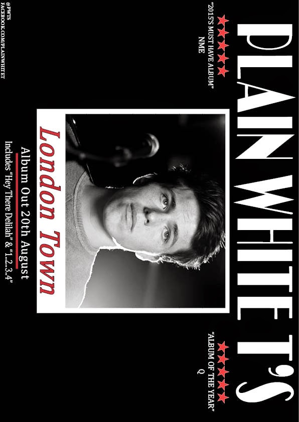
These are my magazine adverts which I have created and constructed myself. In order to make sure I got a feel of what the advert would look like I composed a landscape and portrait version of my work which enforces that what I have created is versatile and could be placed in many locations.
Monday, 26 January 2015
Magazine Draft 1 - Portrait
This is my first draft for my magazine poster which is portrait. I currently am deciding between images to use due to wanting to use a range of shots within the poster to capture readers attention.
Magazine Draft 1 - Landscape
This is my magazine advert that I have created which is landscape. I have decided to create 2 posters which is landscape and portrait to give readers a greater idea and variety of the music. Also it makes the poster more interesting and can fit in with more magazines etc.
Subscribe to:
Posts (Atom)