My main priority for the music video
and ancillary tasks I wanted to created was who would be the target audience and
how would I make my work appeal to them. I decided to
profile my target audience as males between the ages of 16 and 25 due to these
ages being the responsible ages to go to the bands gigs as well as have the
disposable income to purchase the bands tickets or music through disposable
income. Furthermore, the profile I gave my typical audience would be the demographics
and psychographics of individualists that are outgoing and mostly from the
classes ABC1. This is due to although the audience being young students which
may not have all the money to purchase gig tickets their parents elevate their
social status. The Plain White T’s are similar to Ed Sheeran in the sense that both artists
follow the genres conventions in order to be successful with their music videos
and portray the themes and messages they want the audiences to be able to
relate to. Both artist's are part of the same genre and consist of a live performance narrative, with potentially a small narrative within.
To allow the audience to get the best understanding of the music video I wanted to place some of the artists well known traits into the narrative as well as personal experiences. This enabled me to stick to a clear image of the band within their chosen genre and positively put forward the themes as the majority of audiences that enjoy soft rock music would expect to see these conventions. To give an example within my work the official music video for their song “Hey There Delilah” is heavily performance based emotions and themes of a young love with close ups and saturated colour editing of the artist and his surroundings. The idea of this editing subconsciously gives the audience emotions of sadness due to the draining of colour and use of greys This I felt was successful and so used this for inspiration when creating my work with the themes of love and nostalgia which I wanted to portray. I think this is an extremely effective style of editing the video to drain the colour as it conveyed the necessary emotions to the audiences, due to the fact they were focused on substance rather than style. Hence, using the idea of little colour in my live performance; using black and white. Black and White connoting the simplistic ideas and themes and the idea that the emotions are so strong and obvious to the audiences that anyone can relate because it is "black and white in meaning" and so I wanted to use this convention in my own work.
When studying the primary audience I chose to relate my work to their personal experiences and how I was going to highlight specific mise en scene. Therefore I decided to research into theories in which would give me ideas and understanding to do this excellently. I focused on the uses and gratifications theory as I felt if my work consisted of the factors then the audiences could make a relationship with the artist as well as relate to the music video themes and be entertaining. The linear narrative of my music video highlights the male’s memories of his visit to London as well as his memories of the female he met there. The live performance is intertwined with iconic London scenes which represent the City admirably due to many people knowing the city due to these locations of the fact they have personally been there. The extreme close up shots of the female’s eyes and lips can be said to inform the audience the love the artist had for this girl as the lips and eyes can be sexualised to draw individuals in; especially because my primary audience is male and so following the hegnomic norm.
Furthermore another theorist I considered was Andrew Goodwin’s and his theory of the six elements observed within music videos; element one being the visuals are illustrations of the lyrics. An example within my own work with arguably uses Laura Mulvey's male gaze as well, the lyrics “close your eyes” was enhanced through the visuals of the female closing her eyes. The simple idea not only illustrated Andrew Goodwin's idea but due to using the females eyes and lips together from the males perspective enforces the way in which females are seen in the media by audiences. I furthered this with the idea that when the lyrics “walking to you” I captured the females shoes walking round the halls of her school, which later linked to the ending lyrics “two more years and you’ll be done with school” which gives the music video constant linking and repetition throughout. A final example which is a strong link to Goodwin’s theory is the constant reference to the artists iconic guitar, close ups appear capturing the detail and visually showing the audiences his guitar I which arguably made him famous.
Once I had focused on the idea of audience relationship with the video and artist I also needed to consider how to portray the themes which needed to be consistent and run through the song successfully. In order to make the theme of nostalgia and love for the city apparent I needed to refer to Saussure’s theory of signs and signifiers and represent them clearly within my video. An important factor for my music video I felt would make the work seem professional and realistic was the focus in the planning and research stage when deciding on the mise en scene; lighting and props in particular. This was due to the choice in lighting of 800W hotheads and a soft box with the guitar as a prop enabled me to ensure I was demonstrating my intentions to the audiences that the genre was soft rock and live performance. The audience would subconsciously understand this as they would have typically been to gigs in the past and so would understand the lighting choices as well as an acoustic guitar being an iconic signifier for the soft rock genre. I was aware that the focus for soft rock music was more about the substance rather than the styling and so I felt I needed to understand this element with in more detail hence I created mood boards and researched the genre to come to terms with the importance of the lyrical focus and how I would want artist to be styled. Hence when it came to the mise en scene and styling I decided to dress my artist in casual, high street clothing such as jeans, simple trains/shoes and a casual jumper which could be replicated by fans to allow them to common traits.
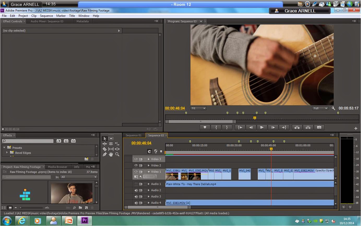
In addition to the lighting I wanted to portray a dream light state which would leave the viewers in awe and be overwhelmed; I was able to create this with the lighting and the editing tools within the program Premiere. I researched lighting which would be the most successful when it came to editing and would help me to create the spot light effect to enhance the detailing of his face. Furthermore I used hard light facing outwards to the camera to create such a drastic contrast when it came to editing in black and white. On top of this, I decided to use a soft box which enabled me to enhance the dream like state as it soften the overall shots I was taking and gave a softer appearance when watched back. The lighting was an important factor of my music video as it was heavily performance based, meaning I had to keep the audience’s attention with the interesting lights and constant change in camera shots and angles. The lighting I chose follows the conventions of typical soft rock music videos due to the fact I used a Redhead which is typically used for stage lighting. The majority of soft rock music videos are performance based and so use Redhead which are a typical convention, again seen in Ed Sheeran’s ‘Thinking out loud” as well as The Plain White T’s music videos. This is because the term “spot lights” connotes live performances and gigs which is what my chosen band is known for and so successfully fitting the music video into the small, exclusive image they have portrayed.
Throughout the editing process of my music video, I decided to use the use of colour and contrast in my work to make it interesting and convey the difference between performance and narrative. For example I increased the brightness to 4 as well as slightly blurred the London scenes at a scale of 2 so that the bright lighting was not in focus. This would be apparent to the audience instantly as it contrasts the black and white performance narrative. Moreover, being a signifier to the audience that these are the artists dream which are unclear and flashbacks, hence not being as long at the performance shots, subliminally suggesting to the audience we are going back to past trips which are significant to the artist. In addition many people connect the idea of photographs with past memories and so this was delivered throughout all three pieces of my work using the polaroid editing effect and the line and pegs to suggest the images had been taken of personal past events.
When considering how I would improve my work, I feel that if I had more time to create my work and observe it in more detail I would have been able to take more time in editing and understand more editing techniques which would enable me to create a more sophisticated piece of work. Finally when looking back I feel that some mistakes I made along the way could have been altered if given more time as well as consider my choices in a lot more detail and research to make sure the audience feel my work is successful. Overall, my audience feedback was positive given an average of 7 out of 10 for the success and look of the video and digipak. When considering audience feedback as the task went on I began to comprehend that in order to get the best feedback to improve I needed to have detailed questions which would receive open answers. This way I was able to have the best chance at improving my work as I would have a greater understanding of what my audience were looking for. Moreover, leaving comment boxes on my surveys as well as holding focus groups to collect the best feedback and a variety to collaborate my findings as well as find the best technique for me and my work. Personally the idea of focus groups enables me to have conversations with the individuals as well as ask more detailed question and answers as well as being able to point out specific parts.
DIGIPAK & MAGAZINE ADVERT
When considering my digipak and advert I felt it was my most successful pieces of work in respect of being able to relate to the audience. This was due to my colour scheme of blue and gold which as connotations of calm and exclusive due to the band only playing exclusive gigs and so although their styling isn't expensive the limited tickets are, hence the audiences being ABC1 class. Moreover, the genre itself is known to be more lyrical and focused on the on the relationship with the fans they had, hence including a personal message to the readers which would buy the digipak to allow them to feel a relationship with the artist. Furthermore, to make sure my work linked and was recognisable to the audiences I used the same typography in all my work to make sure they could be easily spotted. Finally, I felt that the simplistic and spacey layout kept the focus on the meaning behind the song and kept away from the styling aspect.
To allow the audience to get the best understanding of the music video I wanted to place some of the artists well known traits into the narrative as well as personal experiences. This enabled me to stick to a clear image of the band within their chosen genre and positively put forward the themes as the majority of audiences that enjoy soft rock music would expect to see these conventions. To give an example within my work the official music video for their song “Hey There Delilah” is heavily performance based emotions and themes of a young love with close ups and saturated colour editing of the artist and his surroundings. The idea of this editing subconsciously gives the audience emotions of sadness due to the draining of colour and use of greys This I felt was successful and so used this for inspiration when creating my work with the themes of love and nostalgia which I wanted to portray. I think this is an extremely effective style of editing the video to drain the colour as it conveyed the necessary emotions to the audiences, due to the fact they were focused on substance rather than style. Hence, using the idea of little colour in my live performance; using black and white. Black and White connoting the simplistic ideas and themes and the idea that the emotions are so strong and obvious to the audiences that anyone can relate because it is "black and white in meaning" and so I wanted to use this convention in my own work.
When studying the primary audience I chose to relate my work to their personal experiences and how I was going to highlight specific mise en scene. Therefore I decided to research into theories in which would give me ideas and understanding to do this excellently. I focused on the uses and gratifications theory as I felt if my work consisted of the factors then the audiences could make a relationship with the artist as well as relate to the music video themes and be entertaining. The linear narrative of my music video highlights the male’s memories of his visit to London as well as his memories of the female he met there. The live performance is intertwined with iconic London scenes which represent the City admirably due to many people knowing the city due to these locations of the fact they have personally been there. The extreme close up shots of the female’s eyes and lips can be said to inform the audience the love the artist had for this girl as the lips and eyes can be sexualised to draw individuals in; especially because my primary audience is male and so following the hegnomic norm.
Furthermore another theorist I considered was Andrew Goodwin’s and his theory of the six elements observed within music videos; element one being the visuals are illustrations of the lyrics. An example within my own work with arguably uses Laura Mulvey's male gaze as well, the lyrics “close your eyes” was enhanced through the visuals of the female closing her eyes. The simple idea not only illustrated Andrew Goodwin's idea but due to using the females eyes and lips together from the males perspective enforces the way in which females are seen in the media by audiences. I furthered this with the idea that when the lyrics “walking to you” I captured the females shoes walking round the halls of her school, which later linked to the ending lyrics “two more years and you’ll be done with school” which gives the music video constant linking and repetition throughout. A final example which is a strong link to Goodwin’s theory is the constant reference to the artists iconic guitar, close ups appear capturing the detail and visually showing the audiences his guitar I which arguably made him famous.
Once I had focused on the idea of audience relationship with the video and artist I also needed to consider how to portray the themes which needed to be consistent and run through the song successfully. In order to make the theme of nostalgia and love for the city apparent I needed to refer to Saussure’s theory of signs and signifiers and represent them clearly within my video. An important factor for my music video I felt would make the work seem professional and realistic was the focus in the planning and research stage when deciding on the mise en scene; lighting and props in particular. This was due to the choice in lighting of 800W hotheads and a soft box with the guitar as a prop enabled me to ensure I was demonstrating my intentions to the audiences that the genre was soft rock and live performance. The audience would subconsciously understand this as they would have typically been to gigs in the past and so would understand the lighting choices as well as an acoustic guitar being an iconic signifier for the soft rock genre. I was aware that the focus for soft rock music was more about the substance rather than the styling and so I felt I needed to understand this element with in more detail hence I created mood boards and researched the genre to come to terms with the importance of the lyrical focus and how I would want artist to be styled. Hence when it came to the mise en scene and styling I decided to dress my artist in casual, high street clothing such as jeans, simple trains/shoes and a casual jumper which could be replicated by fans to allow them to common traits.
In addition to the lighting I wanted to portray a dream light state which would leave the viewers in awe and be overwhelmed; I was able to create this with the lighting and the editing tools within the program Premiere. I researched lighting which would be the most successful when it came to editing and would help me to create the spot light effect to enhance the detailing of his face. Furthermore I used hard light facing outwards to the camera to create such a drastic contrast when it came to editing in black and white. On top of this, I decided to use a soft box which enabled me to enhance the dream like state as it soften the overall shots I was taking and gave a softer appearance when watched back. The lighting was an important factor of my music video as it was heavily performance based, meaning I had to keep the audience’s attention with the interesting lights and constant change in camera shots and angles. The lighting I chose follows the conventions of typical soft rock music videos due to the fact I used a Redhead which is typically used for stage lighting. The majority of soft rock music videos are performance based and so use Redhead which are a typical convention, again seen in Ed Sheeran’s ‘Thinking out loud” as well as The Plain White T’s music videos. This is because the term “spot lights” connotes live performances and gigs which is what my chosen band is known for and so successfully fitting the music video into the small, exclusive image they have portrayed.
Throughout the editing process of my music video, I decided to use the use of colour and contrast in my work to make it interesting and convey the difference between performance and narrative. For example I increased the brightness to 4 as well as slightly blurred the London scenes at a scale of 2 so that the bright lighting was not in focus. This would be apparent to the audience instantly as it contrasts the black and white performance narrative. Moreover, being a signifier to the audience that these are the artists dream which are unclear and flashbacks, hence not being as long at the performance shots, subliminally suggesting to the audience we are going back to past trips which are significant to the artist. In addition many people connect the idea of photographs with past memories and so this was delivered throughout all three pieces of my work using the polaroid editing effect and the line and pegs to suggest the images had been taken of personal past events.
When considering how I would improve my work, I feel that if I had more time to create my work and observe it in more detail I would have been able to take more time in editing and understand more editing techniques which would enable me to create a more sophisticated piece of work. Finally when looking back I feel that some mistakes I made along the way could have been altered if given more time as well as consider my choices in a lot more detail and research to make sure the audience feel my work is successful. Overall, my audience feedback was positive given an average of 7 out of 10 for the success and look of the video and digipak. When considering audience feedback as the task went on I began to comprehend that in order to get the best feedback to improve I needed to have detailed questions which would receive open answers. This way I was able to have the best chance at improving my work as I would have a greater understanding of what my audience were looking for. Moreover, leaving comment boxes on my surveys as well as holding focus groups to collect the best feedback and a variety to collaborate my findings as well as find the best technique for me and my work. Personally the idea of focus groups enables me to have conversations with the individuals as well as ask more detailed question and answers as well as being able to point out specific parts.
DIGIPAK & MAGAZINE ADVERT
When considering my digipak and advert I felt it was my most successful pieces of work in respect of being able to relate to the audience. This was due to my colour scheme of blue and gold which as connotations of calm and exclusive due to the band only playing exclusive gigs and so although their styling isn't expensive the limited tickets are, hence the audiences being ABC1 class. Moreover, the genre itself is known to be more lyrical and focused on the on the relationship with the fans they had, hence including a personal message to the readers which would buy the digipak to allow them to feel a relationship with the artist. Furthermore, to make sure my work linked and was recognisable to the audiences I used the same typography in all my work to make sure they could be easily spotted. Finally, I felt that the simplistic and spacey layout kept the focus on the meaning behind the song and kept away from the styling aspect.